News
Accessible Doesn’t Mean Institutional
September 3, 2019Many designers and consumers alike have an aversion to anything labeled: accessible. That particular label on an apartment can have a connotation of “institutional” or just plain not looking like all the other residential units. Even in retirement living, the Type A apartments (or so-called “ADA” units), which are required by most building codes to comprise of at least 2% of the total apartment units in a development, are often the hardest to sell. Why? Because they (can) look different. However, with a little creativity and just a couple extra design features, these adaptable units can be almost indistinguishable from the other 98% of the apartments.

To back up a little (warning: building code lesson), all apartments in multi-family living have to meet certain usability requirements. This is a result of the Fair Housing Amendments Act of 1988, which augmented the original Act of 1968 to extend housing opportunities to those with disabilities. It’s worth noting that this amendment to the Act preceded the Americans with Disabilities Act by two years. The 1988 Fair Housing Act covered all new construction housing after 1991 that connects more than three dwelling units together to meet minimum accessibility requirements. That means that single family homes are exempt, but townhomes, apartments or any other dwellings of four or more connected by any means are regulated, whether rental, simple ownership or condominium. Developers and owners are sometimes unaware of these minimum standards despite the three decades since the law’s implementation.
This means that even the “standard” units in a typical apartment building, typically called Type B, have to meet some minimum standards. These standards include reasonable accommodations to residents even if that may require the resident to modify the unit (at their own cost, mind you, not the landlord’s). The Type A adaptable units, the 2% mentioned above, are scoped out by most building codes. These standards exceed those required even by the Fair Housing Act above, but not to fully accessible criteria as required in, say, a public bathroom.
The main differences between the two types of units lay in the bathrooms and the kitchen. There are other differences, but they probably will not be recognized by the average consumer. Doorways have to be a quarter inch wider, doors need to have certain clearances in front of them and some receptacles and electrical outlets may need to be lower or higher, but only slightly so.
The area dedicated to the bathrooms of the Type A adaptable unit may be larger than the other units, to allow for the five foot turning radius that a wheel chair requires and some of the clear space requirements on the individual fixtures is larger than those required at Type B units. Other than these differences, however, the actual appearance of the adaptable bathroom can be identical to the standard Type B units. The regulations require that in-wall blocking be installed in the bathrooms at the showers and the toilets for the future installation of grab bars and a shower seat. These items do not have to be installed, however, and the blocking is invisible in the finished product. The sink does need to allow a wheel chair to clear the underside, which in many cases eliminates a base cabinet at this location. Even here, the code allows for a removable cabinet, provided it may be removed easily and the flooring and wall finishes continue behind it. A conscientious designer can incorporate a removable sink cabinet that appears to be built in, matching the appearance of any other bathroom in the building. Shower control locations in adaptable units are also required to be on the long wall of the 3’ x 5’ showers typically provided in senior housing. This can place the shower wand in a location that would spray water out of the shower, as opposed to if it were located on one of the short walls. But the code does not prohibit a diverter and a second, fixed head on the short wall, nor does it prohibit a slightly longer hose on the wand and a second holder on the short wall. Either of these solutions, paired with a wand that has an “off” switch on the dial, can overcome this obstacle.

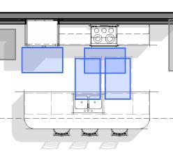
The clear areas dedicated to the kitchen probably is exactly the same between the two types of units, so the Type A kitchen will not necessarily larger than its Type B counterpart. There are, however, two main differences to overcome. First is the provision for a wheel-under sink and a wheel-under work area in the cabinetry. These open cabinets can be filled in exactly as described in the bathroom above. These removable bases can be indistinguishable from those on either side, and removed with just a couple of ordinary screws. The second issue is a little harder to hide. The sink and the work surface have to be a 34” above the floor, which is 2 inches lower than a standard kitchen counter. Typically, the entire kitchen counter is lowered to maintain a consistent countertop height, and while this isn’t required, it does eliminate two low spots on an otherwise regular surface. This is one concession to accessibility that may be difficult to circumnavigate, though in our work in senior living with reputable providers, we have procured variances from the agencies administering the codes to allow traditional 36” countertops provided the building owner promises to replace the entire kitchen counter and necessary cabinets upon the request of a resident. If a variance can be obtained, this essentially eliminates any difference between a Type A and a Type B kitchen.
Designing for accessibility is nothing new, however. Nor should it negatively impact the design. Inform the design – yes: ruin – NO! A real groundswell in advocacy began, with good reason, after World War II. Many thousands of service personnel returned to the US dealing with the physical and mental consequences of modernized warfare. The housing and public facilities to which they returned were not accommodating, and in 1946 a group of paralyzed veterans founded The United Spinal Association in New York; the Paralyzed Veterans of America was founded in 1947; the National Paraplegia Foundation in 1948. Just a few years earlier, accessibility issues were never talked about, not even by our wartime president FDR, who himself used a wheelchair for much of his adult life as a result of contracting polio. But thanks to these service men and women, accessibility advocacy was about to shift to the forefront of public conversation.

Even many architects don’t know that Frank Lloyd Wright, America’s preeminent designer of the first half of the Twentieth Century, designed a house specifically for a client with a physical disability in Rockford, Illinois. In 1949, Wright designed a home for Kenneth Laurent, a disabled veteran, and his wife. The Laurents obtained a $10,000 (that’s about $140,000 today) federal grant for disabled veterans, and Mrs. Laurent wrote to Wright after seeing the Pope-Leighey House in the magazine House Beautiful. She asked Wright if a house could be designed for a wheelchair user on a $20,000 budget. Most of Wright’s Usonian homes are single story and open floor plan affairs. Both of these attributes compliment universal design well.
The Laurent House is consistent with the Wright look and feel, and the incorporated accessible details do not call themselves out. The custom desks, which cantilever from the walls and are completely open below, are as at home here as they would be at Fallingwater, Wright’s famous Pennsylvania home cantilevered off the side of a hill over a waterfall. Even the various storage cabinets fronts were designed to hinge on the bottom instead of the side, making it easier for the client to open them from his wheelchair. The living areas do not express any hint of institutional design. The only perceivable trace at the time may have been wider doors, which to today’s eyes, look completely normal, but in the 40’s it was customary to have 30” bedroom doors rather than a much more wheelchair friendly 36”. Obviously, there are no steps to create barriers into the house from any of the exterior patios, terraces or the carport. Wright’s typical wide overhangs would protect those thresholds from water as well as snow accumulation.


The bathrooms and kitchen were probably the biggest challenge to Wright, as they are to designers today. But it is remarkable that his solutions 70 years ago are strikingly similar to solutions still used today. Let’s be honest. Men of the 1950’s did not likely spend a lot of time in the kitchen. But Wright lowered the countertop to a height similar to the standard required today. To do so, he used a drop in style range so it could be flush with a lower countertop and the controls are all on the front, so that one does not need to reach across the burners and hot pots and pans to adjust the heat. That is an explicit requirement of Type A kitchens today. The kitchen is an open floor plan and allows generous maneuverability within the space. While the kitchen sink is not open below, it is positioned to allow side approach to it. All in all, even with the lower counters, the kitchen looks very much like many other FLW kitchens, and I have visited several.

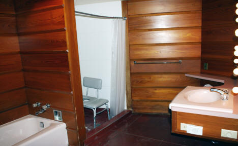
Wright would have struggled a little with contemporary codes in the bathroom, but nonetheless he came up with a few innovations here worth mentioning. In addition to the traditional bathing tub, Wright added a shower next to it. While it is not a true roll-in shower used today, it has a much shallower curb and would allow for easier transfer to a shower chair than anything readily available in the 1940’s. And while there is not as much clearance at the toilet as you would see today, the lavatory cantilevers from the wall and allows full wheelchair clearance below, which was rather innovative for its time.
The fact that the Laurnets lived in this house for 60 years is a testament to Wright’s foresight into what would one day be called universal design and allowing the family to age in place in their home. They even added on to the house when they adopted a child years later. Perhaps Wright’s age when he first conceived of the home aided his design. He was 82 years old and probably less mobile than he was in his youth.
Accessibility features in living units do not have to constrain design or stand out like billboards. Done sensitively, these features can work seamlessly with the overall design of the space, making it usable to the widest range of potential users possible. It will not just eliminate barriers for those with disabilities, but it should benefit as many users as possible, from those in wheelchairs to those on skateboards.

In the 1950s, Architect Henry Y. Shaub Introduced Mid-Century Modern to Lancaster
August 21, 2019This is the fourth article in a series focusing on Henry Y. Shaub, an architect who had a lasting impact on Lancaster County.
Architects by nature are innovators as well as problem solvers. Google CEO Eric Schmidt said “…innovators don’t just listen to what people tell them; they actually invent something new, something you didn’t know you needed, but the moment you see it, you say, “I must have it.”
In 1952, architect Henry Y. Shaub sat down with funeral home directors Mr. and Mrs. Robert F. Groff, Sr. and presented two very different design concepts for their proposed new funeral home on West Orange Street. According to their son, Robert F. Groff, Jr., “. . . Mom and Dad were handling half of all the funerals in the city and needed to expand their facilities.” Although funeral home designs were not Shaub’s forte, he took this opportunity to think creatively and help the Groffs reinvent the aesthetic for a building of this type.
Good architects typically present their clients with several options to choose from, with the hope that one will resonate and lead to further refinement. Historically, funeral homes or parlors in the city of Lancaster were housed in either repurposed mansions or in new structures designed in a conservative architectural style such as Colonial Revival. Shaub presented the Groffs with two very different options.

The first was a predictable and attractive three-story, three bay, red brick neo-colonial concept with a one-story annex including an overhead garage door to screen visitor parking from public view. The second concept was an entirely different look for a funeral home and featured a style foreign to the city of Lancaster—mid-century modern. Characterized by a clean aesthetic with an emphasis on rectangular forms, horizontal lines and an absence of decoration, this second concept, which the Groffs selected, turned heads in a city steeped in traditional architecture!
Groff, Jr. recalls that his parents said to Shaub: “. . . make it look like a marble monument and give the funeral home a new look!” The result was a building that stood out in sharp contrast to the surrounding neighborhood and remains one of the few genuine examples of mid-century modern architecture in downtown Lancaster today.
Design Intervention is written by Gregory J. Scott, FAIA, Partner Emeritus
For LNP subscribers, here is the link to the original LNP Article, “In the 1950s, architect Henry Y. Shaub introduced a new style to the city.”

Congratulations Kelly Wood!
August 20, 2019RLPS Interiors is excited to announce that Kelly recently passed the National Council for Interior Design Qualification (NCIDQ) Examination and earned her NCIDQ Certificate. The rigorous, three-part examination covers all aspects of the interior design professional practice and related topics such as codes, sustainability and universal design.
An RLPSer since May 2013, Kelly earned a Bachelor of Arts, Art History from Wake Forest University and a Masters of Science, Interior Architecture & Design from Drexel University. In celebration of this accomplishment, we asked her to share a few thoughts about her journey to earning this accreditation.
What was your inspiration to become a commercial interior designer?
My parents were the inspiration that led me to where I am today. We didn’t have a lot of material things when I was growing up, so anything we needed or wanted, my parents provided by using their hands and creativity. My dad could build anything. My mom could sew anything. They are an incredible team—hard working, practical, kind, and loving. I thank God every day that I’m their child!
In addition to that foundation, I like being purposeful in everything that I do so interior design seemed to be the perfect balance for me. I was happy to find a profession that encourages creativity, has practical applications, and serves others.
What was your motivation for obtaining this credential?
Becoming certified was something I wanted to prove to myself that I could do—that all my time spent in college and then working within the profession had prepared me for the ultimate test. I have always set goals and pushed myself in other aspects of my life, so pursuing this career goal was a natural step for me. I knew it wouldn’t be easy, but I also knew it would strengthen me professionally, regardless of the outcome.
What were your study habits when preparing for the exam?
The entire study process was somewhat comical because I decided to start a family AND my journey to NCIDQ certification at the same time. When I was pregnant with my firstborn, I was able to carve out time to study any day of the week. I did not realize how rare that would become. After baby one, two, and three in consecutive years, my study time became extremely limited – especially when my husband was working. He’d be gone 24 hours at a time, 15 days a month so I had to be disciplined and take advantage of study time whenever possible.
Eventually I fell into a rhythm that worked for our challenging schedules. As soon as the last baby was down for the night, I’d whip out my books and materials and study until I couldn’t keep my eyes open anymore. I accepted the fact that as painful as it could be on some nights, it was temporary. Luckily, I wasn’t used to sleeping through the night anyway!
Having kids to take care of at all hours of the day and night set me up for success in the long run. One of the nicest parts about the journey was having them along for the ride. Each of them was in my belly at one point so whether they liked it or not – they were part of the process. Every time I took an exam, I could feel one of them kicking inside me. It was my very own little reminder that no matter how nervous I was on exam day, I wasn’t alone.
My husband Ty was a great help as well. When he was able to be home, it was awesome to steal away some time to study. His love and encouragement never wavered and there’s no way I could have done it without him. I’m just so happy it’s behind me!
What are you looking forward to doing now that you have a bit more free time?
I’m not quite sure I will have a lot of free time in the next 18 years, but I look forward to sleep whenever I can get it.
Wondering about the photos?
It’s an RLPS tradition that firm partners cut the scarf (or tie) of a newly credentialed interior designer or architect during our monthly staff meeting. Although the history of this practice is a little murky, the tradition continues mostly because it’s fun and certainly worth celebrating the achievements of our staff members.

Join Our Team – Construction Administrator
August 5, 2019
Current Position Opening
RLPS is seeking a Registered or Graduate Architect/Architectural Engineer with a minimum of five years’ experience. Candidates must have knowledge of construction contract documents and building code requirements. You will be the point person during the construction phase with diverse responsibilities for providing document reviews, responding to information requests, coordinating job site meetings and visiting construction sites to visually assess progress and quality of work. This position includes travel and requires strong organizational and communication skills working closely with other team members and personnel on job sites.
Founded in 1954, RLPS is a full-service architectural and interior design firm in Lancaster, Pennsylvania. Our promise is to share our passion for what we do – for projects large and small throughout the country, serving our clients in the senior living, educational and commercial markets, or for “after-hours” creative pursuits like our annual gingerbread display. RLPS offers a competitive salary and benefits package, continuing education opportunities, and many extras from bi-monthly catered employee lunches to our summer hours option.
To confidentially apply for this full-time position, please send your cover letter and resume to Stacy Hollinger Main, Partner, at humanres@rlps.com or 250 Valleybrook Drive, Lancaster, PA 17601. Equal-opportunity employer

Kendal Communities – Annual Marketing Meeting
August 1, 2019 The old adage “Bigger is Better” is not necessarily true as it relates to housing for seniors. The size of an independent living unit, either free-standing or within a larger building is not the determining factor in its marketability or financial success. Rather efficient use of space, the quality of finishes, access to the outdoors and natural light, inviting spaces and amenities, and flexibility are now the benchmarks for marketable and financially successful housing for seniors.
“Living Small to Live Big” explores design techniques, marketing strategies, and case study examples for creating appealing smaller units.
Click on the title link to download a pdf version of “Living Small to Live Big“.
Interested in this or a similar presentation for your community? Please contact us at your convenience.

A New City School Brought Spanish Revival Flair to 1920s Lancaster
July 24, 2019This is the fourth article in a series focusing on Henry Y. Shaub, an architect who had a lasting impact on Lancaster County.
 The world expositions of the 19th and 20th centuries often led to new architectural styles in the United States. The Panama-California Exposition of 1915 was no exception. San Diego hosted a two-year long celebration for the opening of the Panama Canal. The architects who designed the structures for this grand event deviated from the Greek and Roman architecture traditionally used for these types of exhibitions and instead selected Spanish Revival for the theme. This unique style featuring red tile roofs, walls of stucco, decorative wrought iron and half-round arches, doors and windows captured the attention and imagination of visitors everywhere, including those from the east coast.
Local entrepreneur Milton S. Hershey and architects C. Emlen Urban and Henry Y. Shaub were captivated by the charm and character of this non-indigenous architectural style and quickly introduced it into their domestic and public buildings when possible. Considered informal, eclectic, fanciful and romantic, the Spanish Revival style remained popular from 1915 to 1940.
By the 1920s, Shaub was emerging as the “go-to” architect in Lancaster County for school design work. In 1923, the school directors of Lancaster City retained Shaub to design what was to be the largest and best equipped elementary school in the city: The George Ross Elementary School. The new school building included 21 classrooms, an auditorium and gymnasium.
The architectural features Shaub selected include low profile hip roofs with red clay barrel tiles, large half round arched windows and door openings, decorative wrought iron grills, cast stone decorative motifs including open textbooks, deep-bracketed overhangs and blind niche balconies. In lieu of traditional stucco on the walls, Shaub elected to use a buff colored wire-cut brick to create the visual texture found in stucco. Today, 95 years later, George Ross continues to serve the needs of elementary school students in a setting and a building design that has withstood the test of time and style despite its Southern California heritage.
Design Intervention is written by Gregory J. Scott, FAIA, Partner Emeritus
For LNP subscribers, here is the link to the original LNP Article, A New City School Brought Spanish Revival Design to Lancaster in the 1920s.
This Old Architect
July 21, 2019Surprisingly, many of the lessons I’ve learned over the years have little to nothing to do with designing buildings. That doesn’t mean they weren’t worth learning.
Recently, my wife and I were fortunate enough to visit the set of This Old House, which is to say, the active work site of a home renovation in Westerly, Rhode Island. I won a contest as a member of what they call the “Insiders”. It’s a yearly subscription where you get access to every show produced, plus a digital version of the magazine, plus New Yankee Workshop. This is not a commercial but seriously, if you are fan, check it out.
I was extraordinarily excited to put it mildly. My daughter heard me talking about the upcoming trip and hit me with the “Nerd” label. Whatever…! I was stoked. I watched the show as far back as I can remember. You watched what was on then and there were only 12 channels to choose from back in those days, but as my studies and career led toward architecture, I continued to watch. Even with the flood of home improvement shows of the last couple of decades that concentrate on the entertainment rather than the education aspect; or the shock value rather than the shop value, This Old House was always my go to program.

My wife and I watch every Saturday morning with our coffee, whenever possible. We watched together before we even owned a home. In fact, she will be the first to tell you that it was because we would watch this program together and then launch right into a Penn State football game on a Saturday morning, that it first occurred to me to ask her to marry me. Well…It didn’t hurt.
The trip from Southeast PA to Rhode Island was not going to be an easy one, we knew. It is about 300 miles but can take anywhere between 5 and 6 1/2 hours, depending on traffic in the greater New York area. We had to brave it in a torrential down pour, too. We left the night before the shoot in order to be on site by 11 AM on a weekday. We got to our hotel at about 11 PM. The following morning, our hotel room electronic lock decided to malfunction while we went to breakfast. I think I may have scared the young lady working the desk at our hotel after her efforts to open the door went nowhere after about 40 minutes. I believe I demanded a locksmith, another room to shower in, and threatened to tear to the door off the hinges in order to get to the show.
Eventually, the door opened, but we were warned not to shut the door unless someone was inside to reopen it. We only had a short 15 minute drive to the job site. We even had a couple of minutes to spare and drove around the neighborhood and to the shoreline, which was only a mile or so away. Unfortunately, the rain the night before had flooded the shoreline streets, so we had to turn back.

The project house sat at the back of a cul-de-sac bristling with activity. We parked a little way away to keep out of the hustle and bustle of the various work trucks. Other cars started showing up and looking for a place to park like we did. After a while, everyone started migrating over to a pop up tent that looked to be our welcome center. A young man with a huge smile stood at the entrance into the cul-de-sac to greet us – his name was De’Shaun Burnett and we came to learn he was one of the newest apprentices along with Kathryn Fulton. They were so engaging and happy to see all of us, that by the time we had to leave the site, I wanted to adopt them!
As the other winners of the contest assembled, we found that there were about 15 winners and 15 guests coming. Most of the visitors were husband and wife and most of the winners looked to be retirees. So my wife and I pulled the age demographic down – I think there were 3 couples in our age range (40’s) and one couple in their 20’s, but the rest seemed to be in their 60’s. Then I saw the host, Kevin O’Connor walking around the site! I resisted the urge to point and shout, but his presence was definitely noticed by all the other visitors too.

It was an active job site indeed. My wife was in the residential home building industry for a decade, and she commented that she missed the smell of fresh sawn lumber – there was definitely real work being done. At the appropriate time, all of the guests were ushered into a second floor bedroom to watch a very small monitor of the opening shot for the day. There were about 30 folding chairs facing a screen about 24 inches wide. It was kind of funny and Chris Wolfe, who is the Executive Producer and General Manager of all the This Old House Productions television series, made light of the fact that they pulled out all the stops for our visit. It was Chris’ job to entertain us all until the production team was ready downstairs. The group was very engaged and asked a lot of questions, and Chris was reprimanded on one occasion for making us laugh too loud. Questions mainly pertained to the process of how they pick the project houses, at what stage is the design in when they do, how long the process is, etc. The Q&A session could be a long post in and of itself.

The house was essentially fully framed but drywall had not yet started, so from where we sat, we could see the entire floor through the open studs. Obviously any noise would travel down the open stairs to where the team was shooting. They started with the “long open” shot, where Kevin O’Connor arrives on site and walks through the house and happens upon whatever work is happening that day. This day happened to be installing a coffered ceiling detail. We learned later that it was supposed to be installing some doors, but the rainy weather required the team to reorganize the day at the last minute. We obviously had to hush during camera rolling, then between takes, Chris would described various facets of production. During the long shot shooting, we learned that there really is no script, just an outline. Kevin will assess the progress on the house since the last day of shooting and talk with the show runner and crew about what he might say. I think the long shot took about 3 takes and each time Kevin would edit himself and make the shot smoother.
Once he got to the work area inside the house at the end of the long shot, Tommy and Jeff were positioned to talk about the mock-up of the wood trim detail that would become the coffer on the ceiling. It too started with an initial conversation with the show runner about what the viewer would be looking at and what was important to talk about. This shot was more technical and took quite a while to shoot, each take was a more condensed and streamlined version getting to the essence of what needed to be conveyed. It was very interesting. After the initial shot at the work table, various B roll shots were taken for close ups of the work. Care had to be taken to make sure there was continuity with the overall shots previously taken. Questions were posed by the show runner, like “weren’t you holding that with your other hand in the other shot?” As a viewer, you don’t often think about these issues – if the show is done well (obviously, This Old House is).


Once they left the work table shot, they prepared to shoot in the living room where the coffers were to be laid out, so the group was allowed to go downstairs and watch the shot in person. Tommy and Jeff used a layout stick to mark the floor of the room and those marks would later be transferred to the ceiling using a laser. This part was really cool because we could see not only the “shot” but all that goes into the shot. You can see show runner John Tomlin talk to the hosts and ask them to redo a part of the scene, or the camera operator crouched on his knees or how the “extras” walk through the shot the same way every take. Up until this point, the only regular cast members we had the chance to see were Kevin, Tommy and Jeff – and that was all we were expecting to see. But during the end of the shooting for the morning, I turned my head and was surprised to find I was standing right next to Richard! He saw me do a double take and smiled, and after I pointed at my camera and then at him, he nodded with a sly grin.
After shooting, Richard took us outside to talk about how special the septic system here was. As exciting as that subject seems, I really don’t remember what he said about it, but he actually became my favorite story teller of the cast. He genuinely seemed like he wanted to talk to 30 strange fans and even answer one guy’s oddly specific and detailed sewer questions. He talked about how his sons came to decide to work with him in the business, how he took over for his own father in the speaking roll on season one of This Old House 40 years ago after his father got tongue tied and passed those duties on to him in his early 20’s, and finally about how Tommy pranked Kevin the very first time they met by nailing his tool box down to the ground. I left there thinking about applying for a job at his shop! While we were outside, I caught a glimpse of Mark, the masonry expert.

After we talked about sewage for a good long time, we were ready for the barbecue that was part of the contest winnings. They set up tables on the deck and through the house, luckily the weather changed and it was sunny and delightful outside. There was a big buffet of really tasty food. While in line we chatted with a really nice couple who was very close to our age and got tips on where to go on our planned vacation to Rhode Island a month later. we got the skinny on which Newport mansions to see, where the best beaches were – what luck!
We ended up sitting down to eat at a table with Jeff Sweenor, the builder they recently collaborated on with the Net Zero house season, and were working with him again. Chit chat included a discussion of the special wood trim being used, called Solid Select. It is an exterior grade trim that comes from New Zealand that is treated for outdoor use and comes pre-primed. It is so straight and defect free, they not only used it for exterior trim, but used it throughout the interiors as well. Sadly, no one carries it outside New England – yet.
After we finished eating and wiped all the barbecue sauce off our hands, I got all the cast that was there (pretty much everyone but Norm and Roger) to sign my copy of the recent This Old House book. I don’t care if that makes me look like a dorky fan-boy, when else would I get a chance like that? After that, the crew in charge of the Insider contest winners coordinated a lot of photo opportunities which made their way into a very nice article on the day here: TOH Westerly

Jim Mehaffey, AIA, Senior Project Manager
I am an architect with 20-plus years experience in the health care and senior living sector. I am an enthusiastic pragmatist and fan of sarcasm.

SPRING / SUMMER CONFERENCES 2019
July 20, 2019Spring is a busy time for conferences at RLPS. It’s a great opportunity for sharing ideas, learning new things and connecting with our clients and business associates. Please let us know if you will be attending any of the upcoming conferences so that we can say hello.
WE HOPE TO SEE YOU SOON!
LeadingAge Florida Convention and Exposition– July 22 – 23; Orlando Florida – Booth 301
PA Educational Leadership Summit sponsored by the Pennsylvania Association of School Administrators and the Pennsylvania Principals Association – August 4 – 6; Kalahari Resorts Pocono – Booth
THANKS TO ALL WHO ATTENDED!
Pennsylvania Association of School Board Officials (PASBO) – Booth 116
KAPPA/DVAPPA Spring Meeting – Summer Breeze, Successful Campus Housing Updates presented by Mike Wetzel, Franklin & Marshall College, Brett Calabretta, Warfel Construction and Carson Parr / Booth
LeadingAge Leadership Summit – Experience Design for Senior Living presented by Buck Sleeper, EPAM Continuum and Gregg Scott / Kiosk
National School Board Association (NSBA) – Media Center Design Challenge: Hands-on Student Experience Utilizing the 4 C’s
LeadingAge Illinois – The Wave of the Future: Urban Senior Housing Opportunities by Jeff Heitgerd, CliftonLarsonAllen, Eric McRoberts and Dustin Julius and Make Your Markque: Holistic Branding Strateiges for Senior Living Communities by Andrea Guarino and John Mulder, 3Seed Marketing and Jessie Santini / Booth
Environments for Aging (EFA) – April 7 – 10; Salt Lake City, Utah / Get Smart: Smart Home Design Strategies to Improve Quality of Life & Support Aging in Place by Patrick Sampsell, Masonic Villages and Dan Godfrey; Make Your Marque: Holistic Branding Strategies for Senior Living Communities by Rob Love, Love & Company and Jessie Santini; Community Conversation: Designing for People Living with Dementia by Michael Smith, Livewell Alliance, Inc. and Dustin Julius and Better Baths and Creative Kitchen Designs by Eric McRoberts and Jessica Jack.
LeadingAge Maine and New Hampshire Conference & Expo – April 10 – 11; Portsmouth, NH – Innovation Exchange – Hybrid Homes – Evolution in Independent Living by Bill James, RiverMead, Eric Endres and Rob Beal
LeadingAge North Carolina Annual Conference – May 6 – 9; Myrtle Beach, SC – Housing 2020: Innovative Design and Financial Models for Independent Living by Mario McKenzie, CliftonLarsonAllen, Craig Kimmel and Brent Stebbins
United Methodist Association (UMA) Annual Meeting – May 8 – 8; Ft. Myers, FL – Fostering an Employee-Centered Workplace by Steve Jeffrey, Garden Spot Communities and Jessie Santini
LeadingAge Virginia – June 5 – 7; Norfolk, VA – Make Your Marque: Holistic Branding Strategies for Senior Living Communities by Jessica Kraft, Bluespire Senior Marketing and Craig Kimmel
Association of Independent Colleges and Universities of Pennsylvania (AICUP) Meeting on Collaboration – June 19 – 20, Harrisburg, PA – A Second Life for a 50-Year-Old Building by Steve Bobb, Dickinson College, Mike Rader, Barton Education and Carson Parr and Summer Breeze, Successful Campus Housing Updates presented by Jon Enos, Franklin & Marshall College, Brett Calabretta, Warfel Construction and Carson Parr
LeadingAge Pennsylvania Conference – June 19 – 21; Hershey, PA – Bon Appetit: Experience Design in Senior Living by Thomas Garvin, Waverly Heights, Andrey Teleguz, Scopos Hospitality Group and Chris Linkey and Extending Housing and Services to the Middle Market by Lynn Daly, BB&T, Bev Asper, Baker Tilly Virchow Krause, LLP and Craig Kimmel
Masonic Communities & Services Association (MCSA) Conference – June 23 – 25; Portland, OR

Architect highlighted family business with an Art Deco facade
July 1, 2019This is the third article in a series focusing on Henry Y. Shaub, an architect who had a lasting impact on Lancaster County.
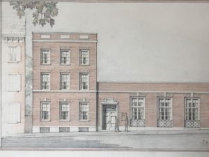
 There remains an unwritten rule in the world of architects: Never work for family! However, there are always exceptions to every rule and Lancaster architect Henry Y. Shaub broke that rule in 1929 when he agreed to design a new façade and interior for his younger brother’s burgeoning shoe business on North Queen Street. Henry and Benjamin’s father, John Shaub, started the shoe business in 1880 and the family maintained it as a Lancaster city landmark until it closed in the summer of 2012.
Part of the store’s stature on Queen Street derived from its unique and unusual style of architecture, especially for Lancaster County, Art Deco. A style born after the discovery of King Tut’s tomb in 1922, and further advanced at the Paris international exhibition Arts Decoratifs in 1925, Art Deco represented luxury, glamour, exuberance and most of all modernity. Art Deco influenced fashion, industrial design, movie theaters, trains, cruise ships, automobiles, jewelry, and even had its own lettering style. From all accounts, the Art Deco style we see on the building today replaced an earlier Queen Anne façade and interior.
Shaub’s expertise included many different architectural styles, but Art Deco was one of his favorites, evidenced by the number of significant commissions where he used it, and McCaskey High School is the largest and most prominent. Some of the notable Art Deco features on the three-story Shaub’s Shoe Store include the large plate glass window above street level flanked by green translucent panels, each with a center-pivot lozenge window, and the one story tall brass lantern mounted above the side entry.
 Additionally, the cast bronze stylized peacocks and zig zag design above the second floor window, the flat relief carvings in the travertine-like stone facing, and finally the signature Art Deco lettering featuring high-waisted center strokes on certain characters all combine to make this an Art Deco façade.
The rear of the building offers a curved brick wall with rusticated coursing, glass block infill and a metal decorative logo ornament above the window. The second floor interior features a graceful and organic iron stair rail leading to the third floor and the prominent and impressive floor to ceiling plate glass window mentioned earlier, with its view down to Queen Street.
Design Intervention is written by Gregory J. Scott, FAIA, Partner Emeritus
For LNP subscribers, here is the link to the original LNP Article, Architect Highlighted Family Business with an Art Deco Facade

1915 YWCA gave Lancaster architect Shaub his career-boosting opportunity
May 19, 2019This is the second in a series focusing on Henry Y. Shaub, an architect who had a lasting impact on Lancaster County.
 All architects wait for the “big one,” the opportunity to showcase their talent and accelerate their careers. For another notable Lancaster architect, C. Emlen Urban, it was the Southern Market in 1888 at the age of 25; for Henry Y. Shaub, it was the YWCA in 1915 at the age of 28. Both commissions were sizable, highly visible and subject to public scrutiny. Not surprisingly, both of these talented architects came out on top.
Urban took advantage of his family connections to the Southern Market Building Selection Committee to help secure his first breakout commission. Shaub, on the other hand, had to employ another tactic to secure his noteworthy and highly sought-after commission. His strategy was collaborating with an out-of-town expert for a design competition. Shaub invited an experienced and accomplished Pittsburgh architect, Harry S. Estep, to join him in submitting a design for the Lancaster YWCA, only the fourth freestanding facility of its kind in the United States. This nationally advertised competition drew interest from east coast and mid-western architectural firms.
The proposed location for the YWCA required a solution that would complement the architecture of the surrounding residential neighborhood, and that would be pleasant to look at from its two primary exposures: North Lime Street and East Orange Street. The Shaub/Estep team chose a style rooted in American tradition and history—Colonial Revival. The 1876 Centennial International Exhibition, held in Philadelphia, had sparked renewed interest in our country’s past architectural heritage. This renewed interest and the resulting Colonial Revival architecture would remain highly popular for another 80 years.
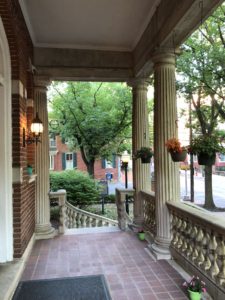 With broad porches, impressive front doors, gabled roofs, fluted Tuscan columns, elaborate dormers, double-hung windows with keystones, Flemish bond brick, fanlights, mutules, quoins and cast stone balustrades, this three and a half story structure provided a familiar appearance and a welcoming presence on a busy street corner. The interior architecture offered a well-designed and well-appointed Colonial Revival experience, including a grand entrance hall and staircase, stained hardwood floors, paneled walls and an impressive auditorium with stage to accommodate several hundred guests.
The success of Shaub’s first major commission set the stage for a long and successful career that would span 58 years and include hundreds of commissions in dozens of building types and design styles.
Design Intervention is written by Gregory J. Scott, FAIA, Partner Emeritus
For LNP subscribers, here is the link to the original LNP Article, 1915 YWCA gave Lancaster architect Shaub his career-boosting opportunity.