DESIGN ON THE SUNNY SIDE: Using Yellow in Interior Design
January 31, 2019 January seems like a good time to highlight yellow–the color associated with warm, sunny days. As with any color, using the color yellow elicits a variety of responses and the emotions evoked are typically related to the specific hue and extent to which it has been applied. Lighter, muted tones work well as a soothing background neutral. More saturated, vibrant options can help to brighten spaces and create the illusion of light.

Yellow in the World Around Us
Yellow can easily be found all around us in nature—daffodils, marigolds, sunflowers, goldfinches, lemons, bananas and bees, just to name a few. It’s often associated with happiness, optimism, creativity and spontaneity, but also has been related to cowardice, betrayal and madness as well as physical illness such as jaundice or malaria.
Yellow is believed to be one of the first colors used in prehistoric cave art. The cave of Lascaux in France has an image of a yellow horse estimated to be 17,300 years old.

The Science Behind the Selection
Yellow is the most visible color of the spectrum. Our eyes process yellow first and our peripheral vision is 2.5 times higher for yellow than for red. Based on these realities, yellow captures our attention more than any other color, including red, which is why it’s used for school buses, fire trucks, caution signs, safety vests and even post-it notes. Interestingly on our screens, yellow is created by combining green and red light.
Although there are strong mustard yellows and deep yellow ochres, there are no dark yellows. In fact, adding black to yellow yields an unappealing yellow-green tone (think pond scum).

Seeing Yellow
As we grow older, the lens of the eye gradually yellows affecting color perception. The yellowing lens tends to absorb and scatter blue light, making it difficult to see differences in shades of blue, green, and violet. Colors may seem duller, and contrasts between colors are less noticeable.
Recognizing this reality, our interior design team utilizes specialized glasses when making color selections for senior living spaces. The glasses approximate this yellowing effect so that we can account for these changes with appropriate lighting and higher contrast between different materials. Bulbs with a color-rendering index (CRI) above 80 can assist older eyes with color definition.

Using the Color Yellow as a Design Tool
The wide spectrum of yellow shades and varying undertones provide flexibility to work well with a number of color schemes and design styles. Select a yellow shade with red undertones if the goal is to warm up and enliven a space. For a more relaxing backdrop, choose a yellow with blue undertones to function as a cool color.
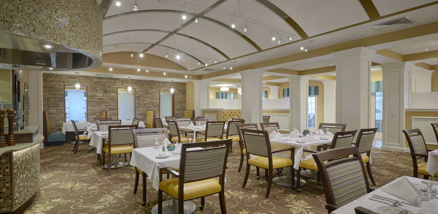
Yellow is a worthy complement to white, blue, black, and gray. With gray remaining such a popular neutral in contemporary design, yellow is a great option for creating visual interest in ways that can be playful or sophisticated.
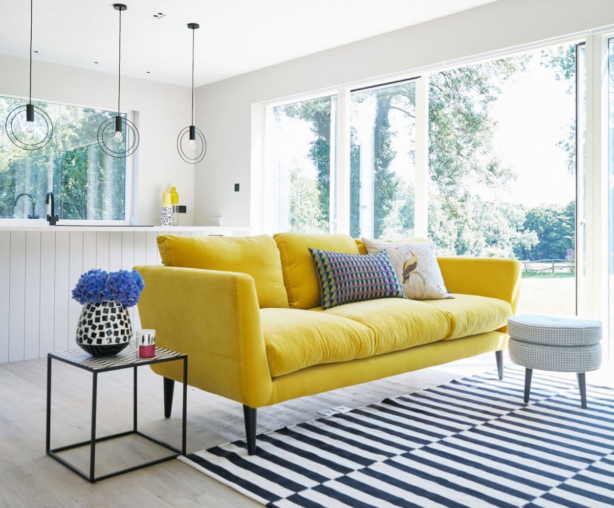
Yellow furniture, walls, or accessories add light and brightness, even to a small space. Yellow walls work well in combination with other strong accents, such as dark wood elements or strong grays. Conversely, it functions as a worthy complement to lighter features like white trim for a serene cottage-style look.
However, due to its high light reflectance value, yellow can become overwhelming if not handled properly. Overdoing brightness (like a neon yellow wall) can quickly become more irritating than welcoming.
The design potential varies depending on the selected shade:
- Using the color yellow on a wall can make a compact room feel larger.
- Strong, saturated shades of yellow create the illusion of light in hallways or rooms without windows.
- French vanilla, a combination of yellow, beige and white, provides a livelier backdrop than white, without being too bold.
- Buttery or straw-yellow walls add a warm glow for a cozy feeling.
- Muted yellows can make a room feel peaceful.
- Pale ocher and muted gold evoke a timeless aesthetic.
- A deep yellow combined with gray can make a space feel sophisticated.
Yellow works well as an accent color for rugs, throw pillows, blankets, lamps and accessories. Even brighter shades of yellow will typically not overpower, providing an appealing accent when used abundantly. Conversely, a touch of bright yellow will provide visual interest to accent your color scheme even when used sparingly.
So think sunny days and cozy up in a yellow blanket. Spring will be here soon.
Blog Editor – Jodi Kreider, LEED AP
For more on yellow:
A few additional examples of interiors where yellow is the highlight – Cheerful and Bright Interior Design Using The Color of Yellow
Here are some great suggestions and photo examples illustrating how yellow works especially well with gray – Gray and Yellow Living Room Ideas.
And in case you were wondering, some of the earliest yellow pigments were rather inhumanely obtained – Colorful Stories of 5 Obsolete Art Pigments.
Photo Credit: Vincent Van Gogh Sonnenblumen – Wikimedia Commons